Text: Don’t Make Me Think: A Common Sense Approach to Web Usability. (Introduction chapter)
Another lesson on usability! This is becoming my favorite subject.
This book argues that usability is partly just common sense, which I agree with. The point of usability is to make it so that the user doesn’t have to think about what they’re doing. Why should they have to think? A web experience should be (as the author put it) as easy as walking down an aisle at the supermarket, meaning that it shouldn’t be hard to find the information one needs.
Specifically, usability should address attributes like:
Easy to learn
Effectiveness
& Enjoyability
Personally, I never considered aspects like
Website designers realize that internet users scan, not read, webpages. Usability experts realize that people expect to find all of the answers when going to a website. They shouldn’t have to look at a button and wonder “hmm… where will this take me?”
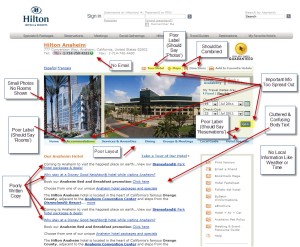
Check out this example
All of those little blurbs? They’re usability issues. They can be anything from the lack of an easy-to-find email address, to unattractive body text, to confusing words like “accommodations” instead of rooms (the more interesting word isn’t always the better one.”
 Here’s another bad example. There’s just too much going on on the page for someone to figure out which information is important and which information isn’t.
Visual elements that help with usability:
 buttons that are obviously clickable
effective visual hierarchies
format content to support scanning
A big way to make sure that a site’s usability is efficient is by having users test it out. How else would you get honest feedback? Usability experts let users try their hand at the software, as well as try it themselves in an effort to quickly find out the source of any problems. One of the most important pages on any website is the homepage. The homepage should easily guide the user to any point within the site, and it should also be very easy to get back to.
So designing a website is much more complicated than it use to be! It’s not just about having a website, its about having an efficient website that people enjoy using.
Take care!
Discussion Questions
1. Is it more important to have a user friendly website when you have other websites as competition, or when customers HAVE to go to your site (like with a specific bank)?
2. Whats the most annoying usability flaw?
